LinkedIn – OTIS Brand Refresh Supported the rollout of LinkedIn’s 'In It together' brand refresh, a strategic shift moving the visual language from a static job board to a warm, inclusive community.
Long Story Short
LinkedIn introduced a massive brand overhaul (Project OTIS) to shift from a "static job board" to a "warm, inclusive community." While the core identity (logo, typography, color palette) was established by the Brand Systems team, the challenge was scalability: How do we apply these high-level concepts to thousands of daily marketing assets without losing consistency?
My Contribution:
I served as the bridge between the high-level Brand Guidelines and the "trenches" of daily marketing.
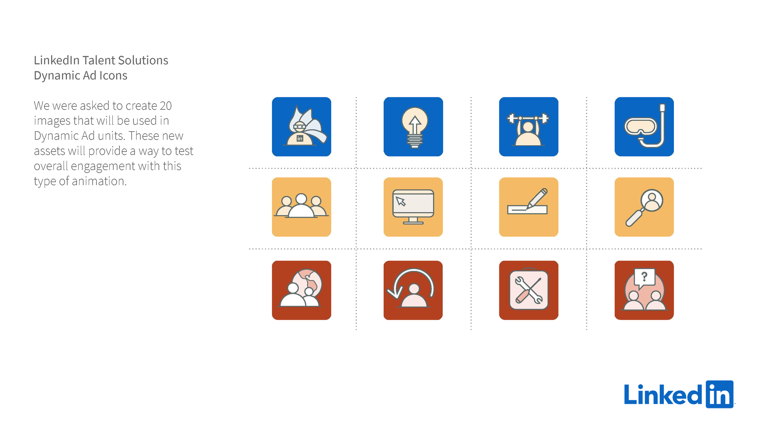
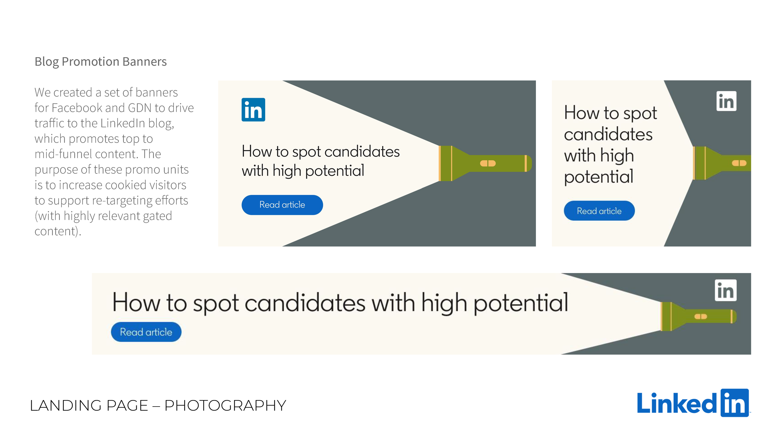
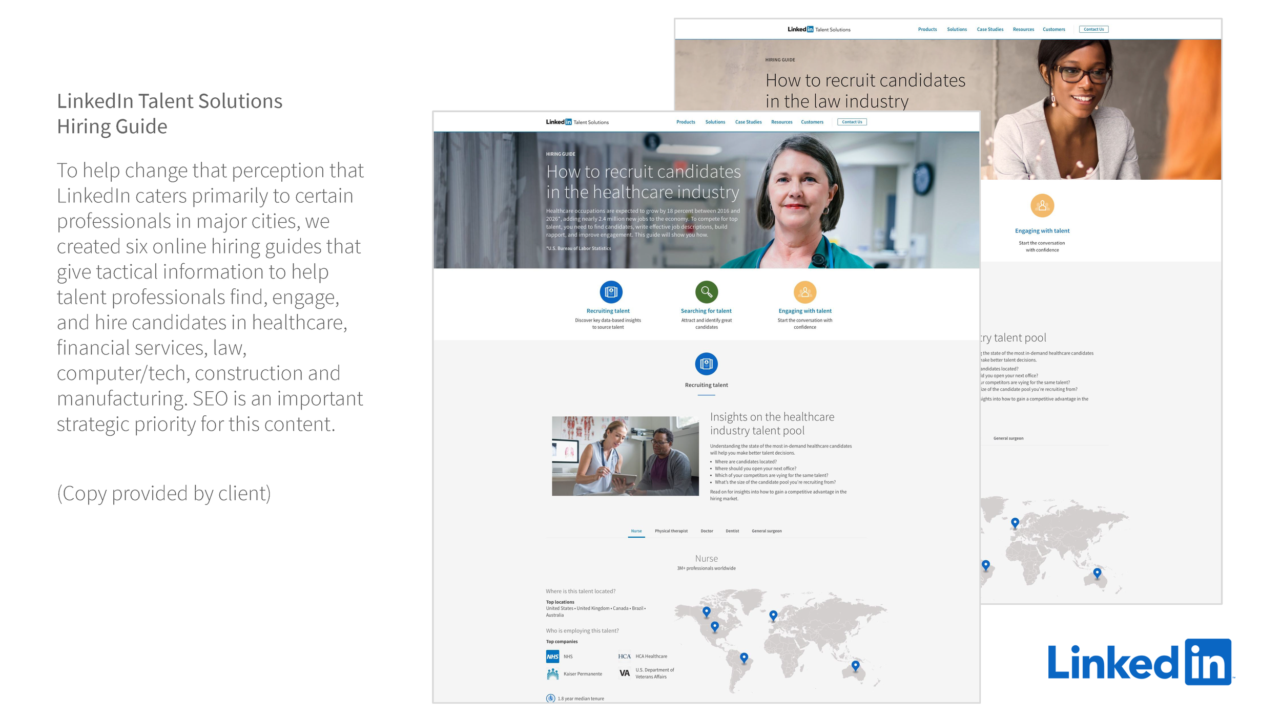
System Stress-Testing: I took the theoretical brand rules and applied them to complex real-world deliverables (ebooks, display ads, event booths), identifying where the guidelines needed to flex or expand.
My primary role was translation: taking the high-level new brand guidelines and interpreting them for day-to-day execution.
In It Together
Deep Dive
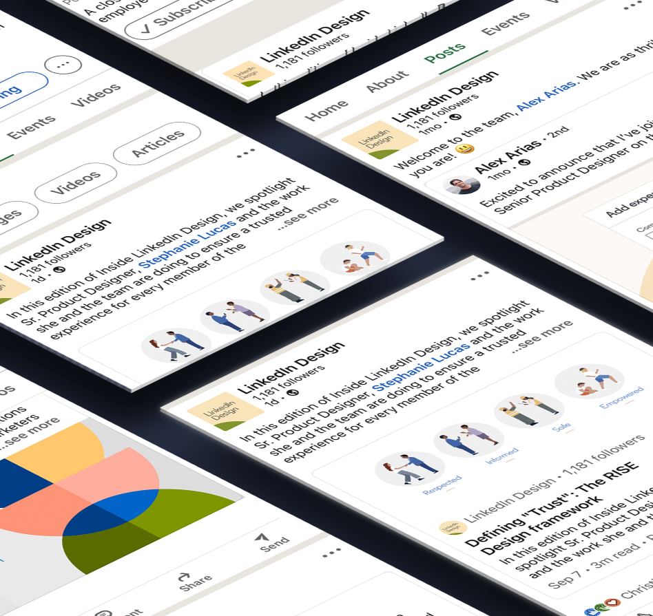
“IN It Together” was part of a full-fledged marketing effort, including digital display, paid social media, online video, outdoor/out-of-home, radio, podcasts, search-engine marketing, and other partnerships.
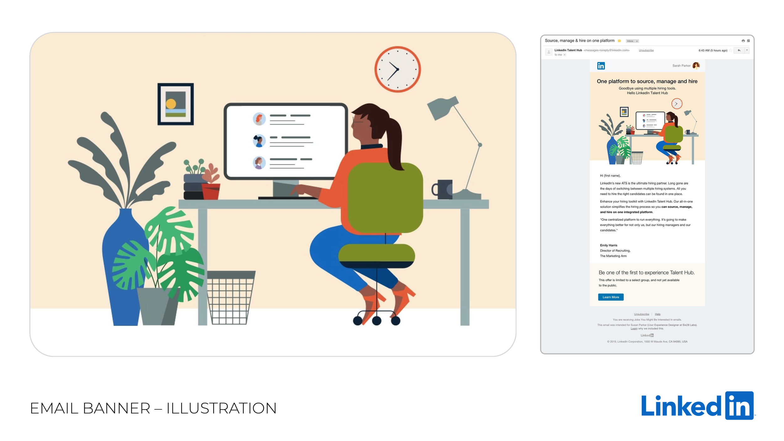
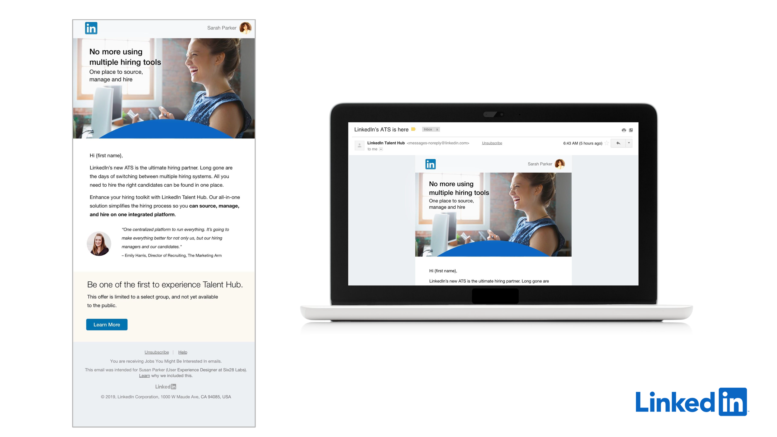
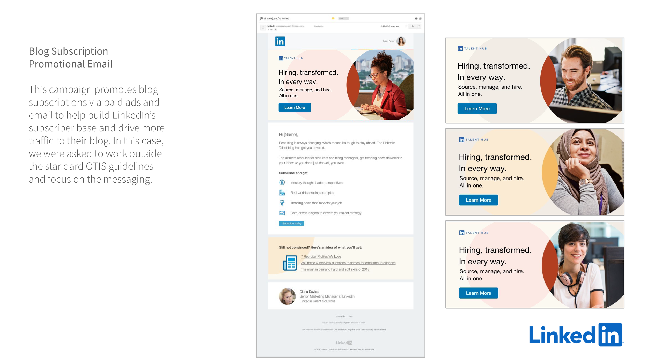
Being part of this transition by LinkedIn gave me the opportunity to experience working on user experience strategy, web design, email strategy and design, banner advertising, digital and social design, print advertising, ebooks design, video creative and production, animation, campaign swag, and much more.
Here are some examples:
IlluStration
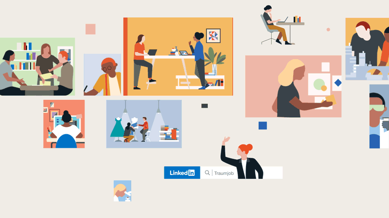
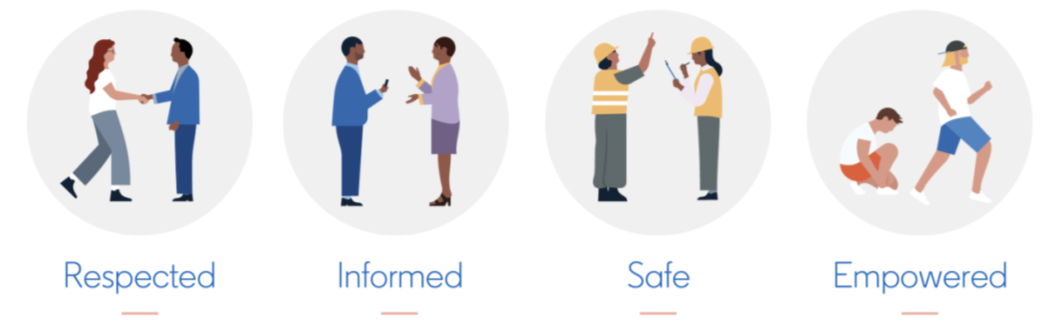
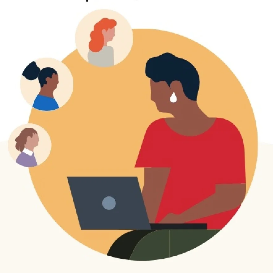
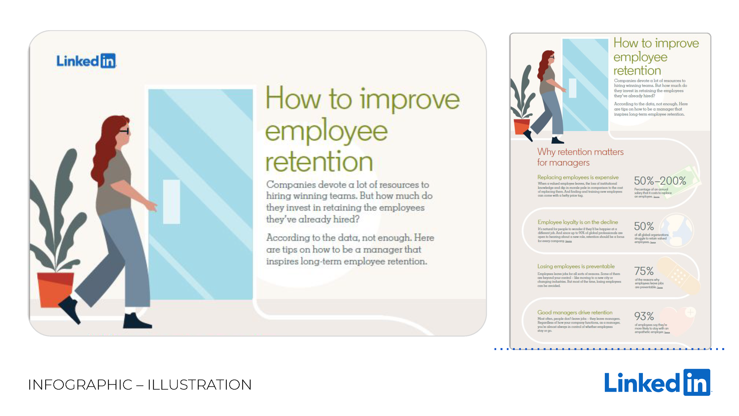
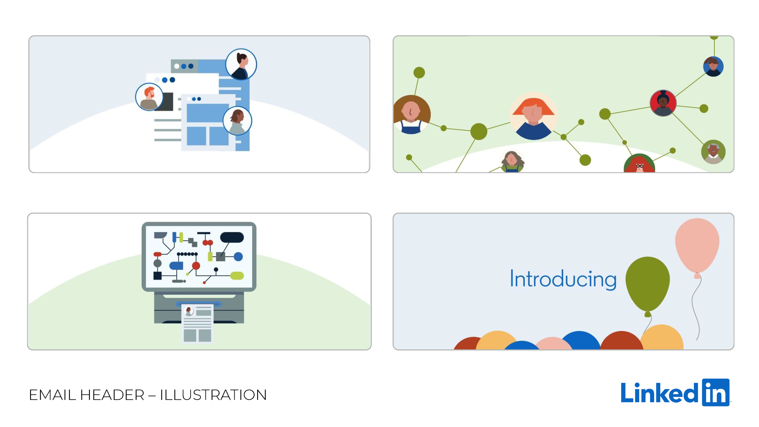
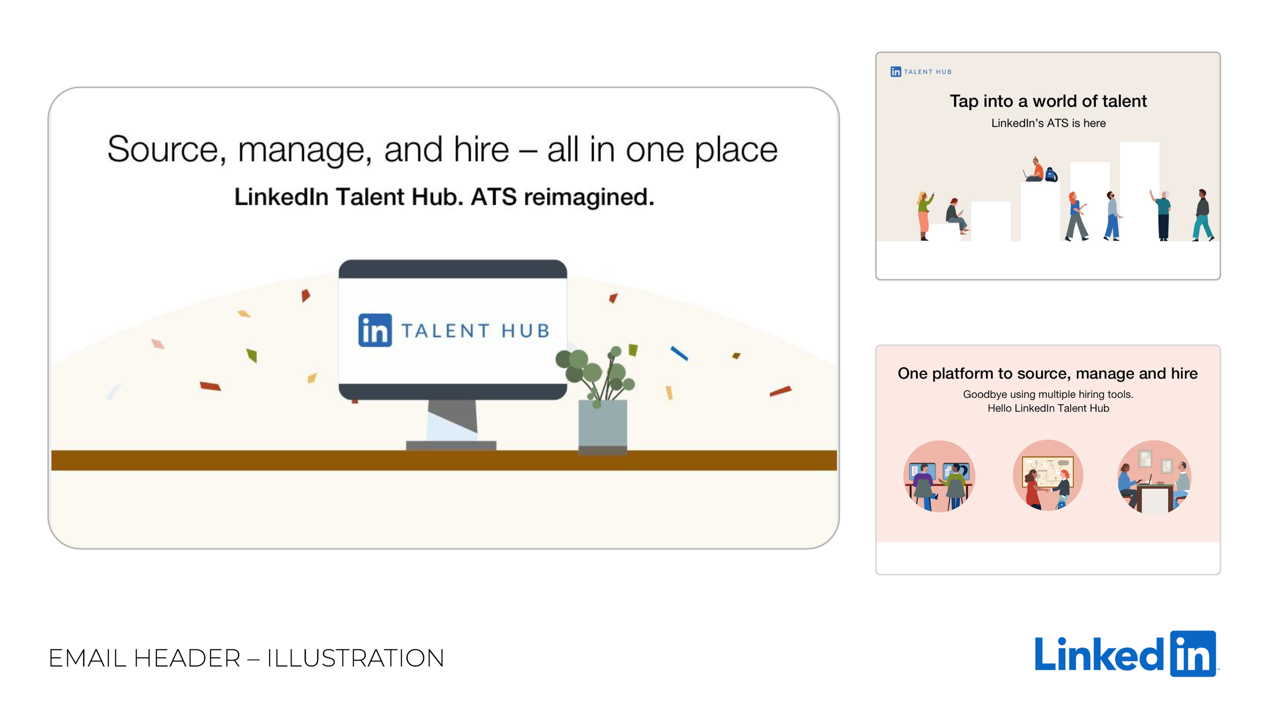
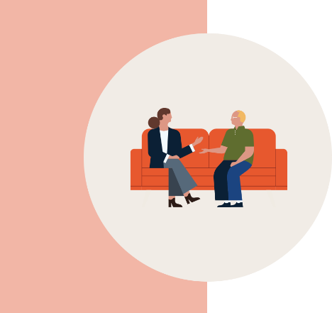
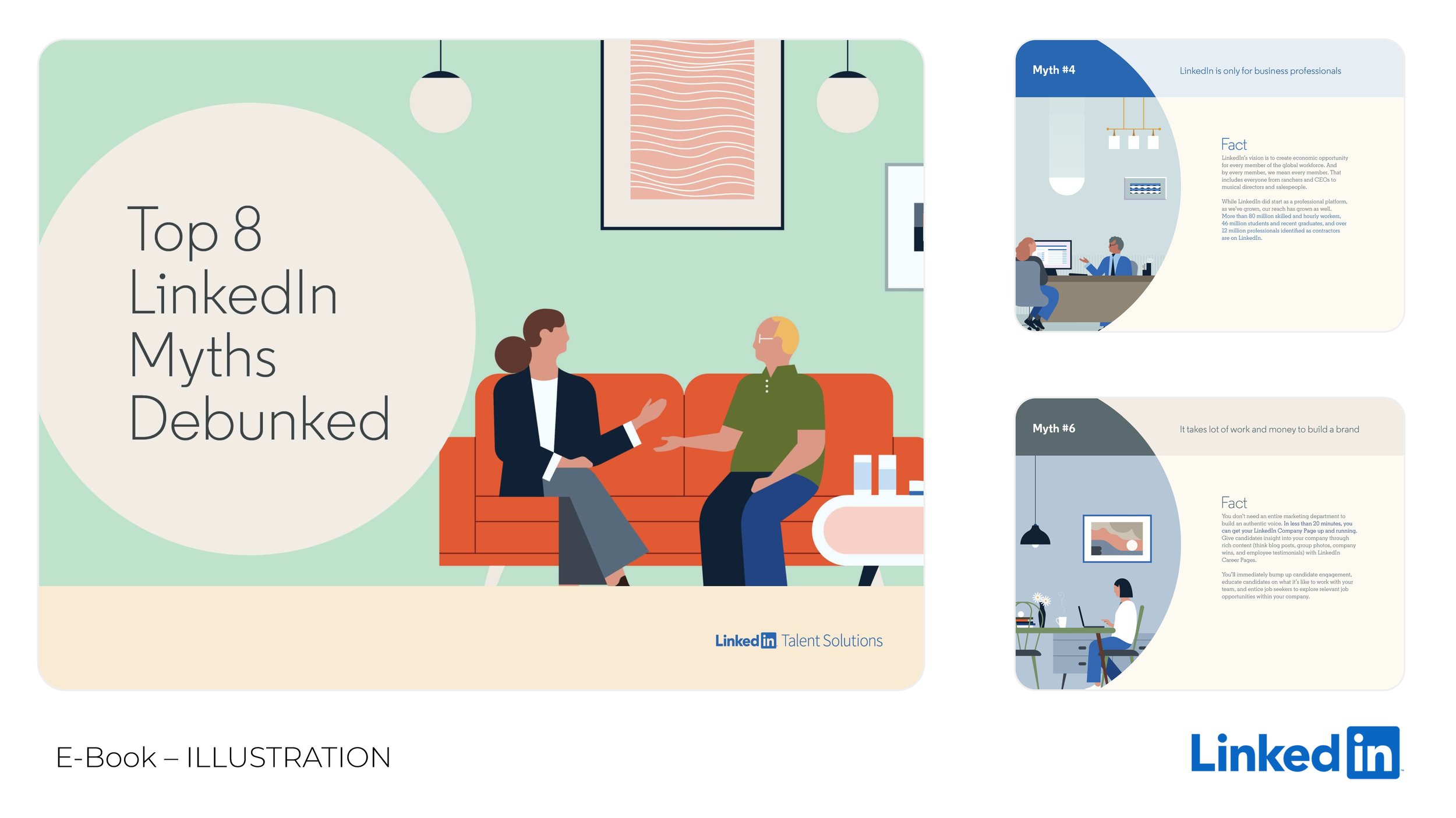
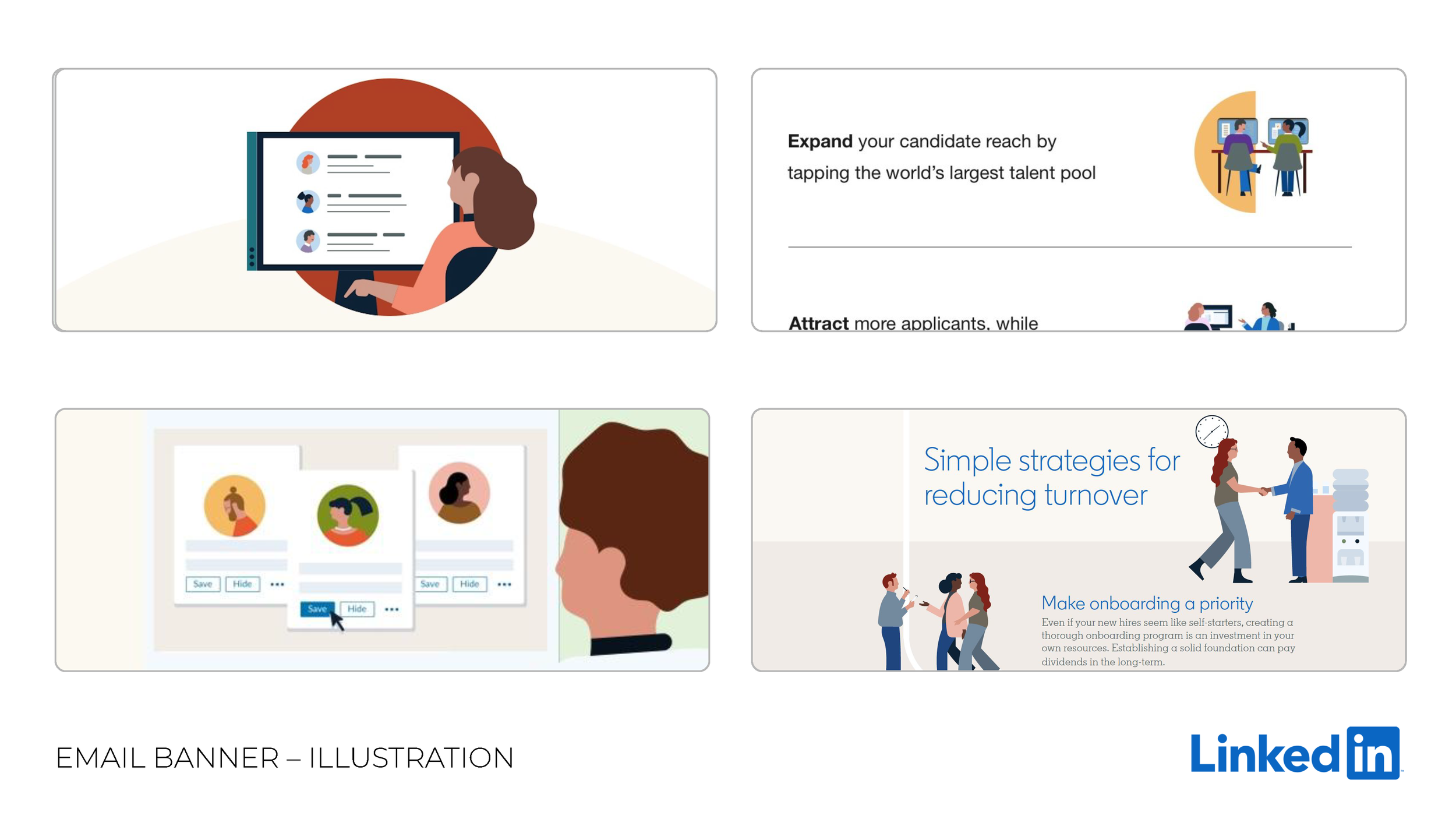
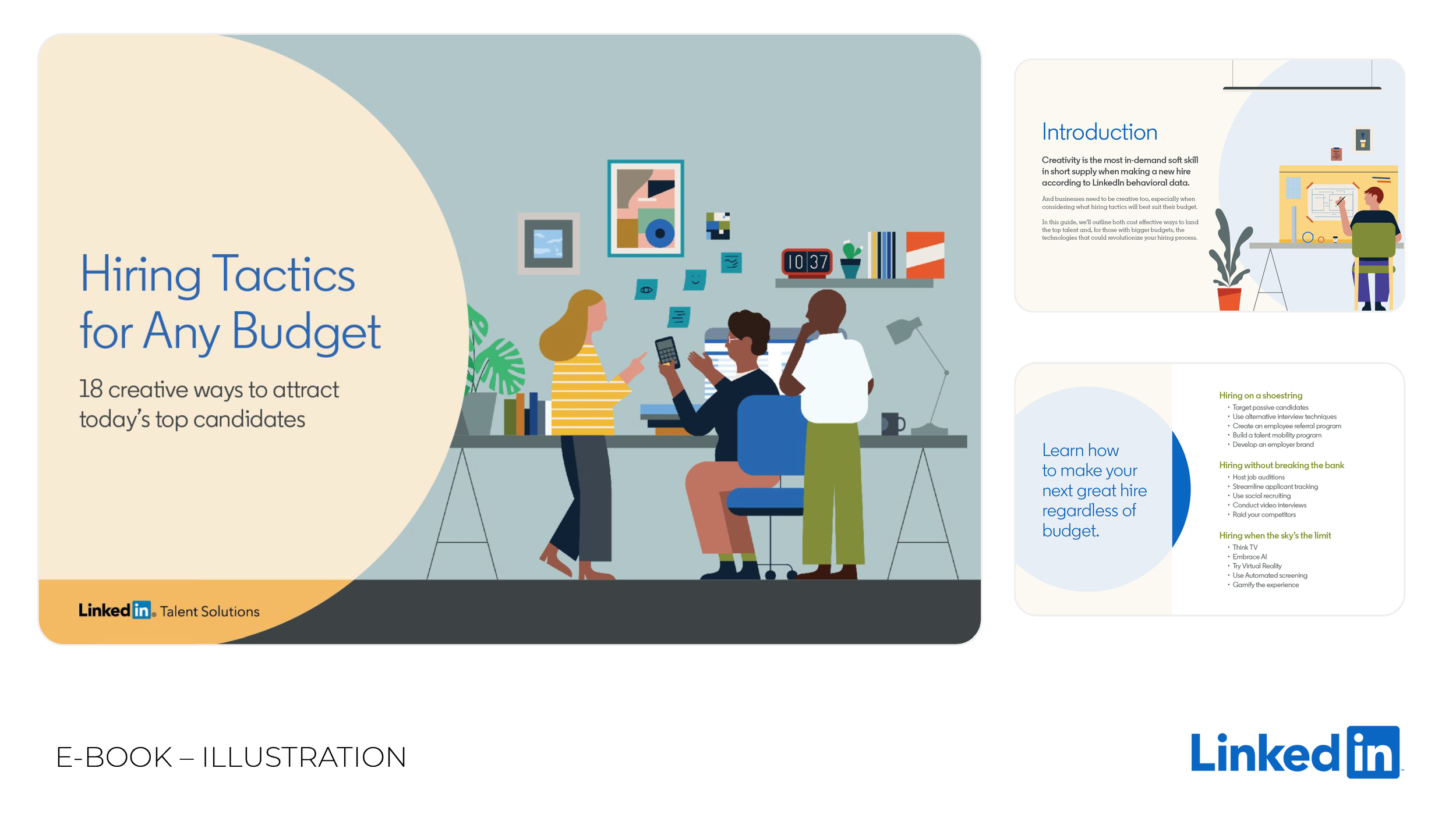
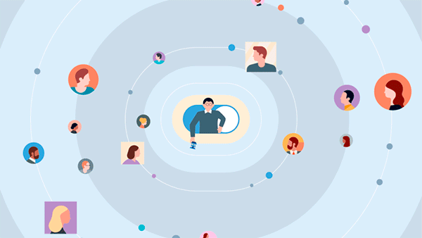
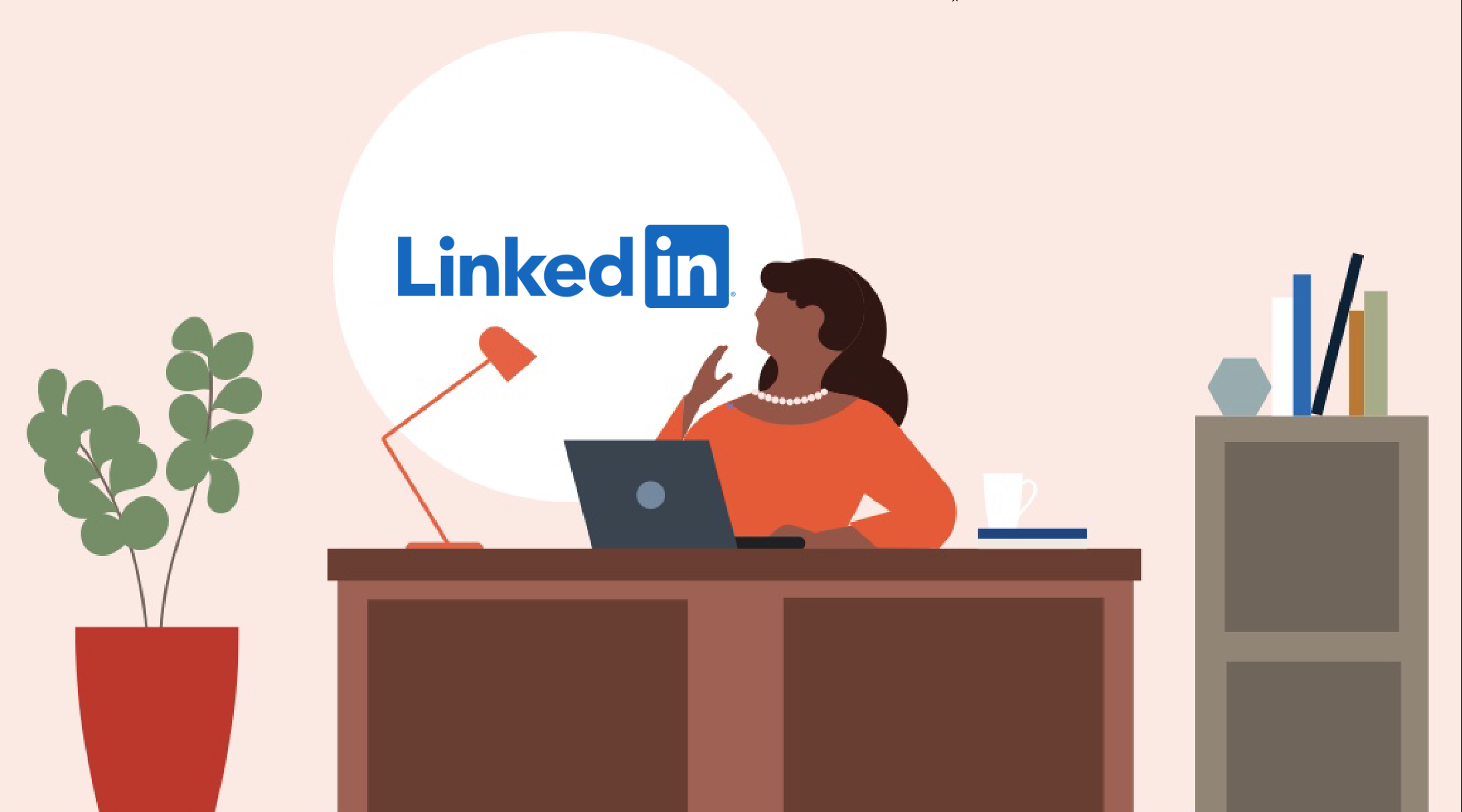
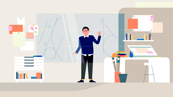
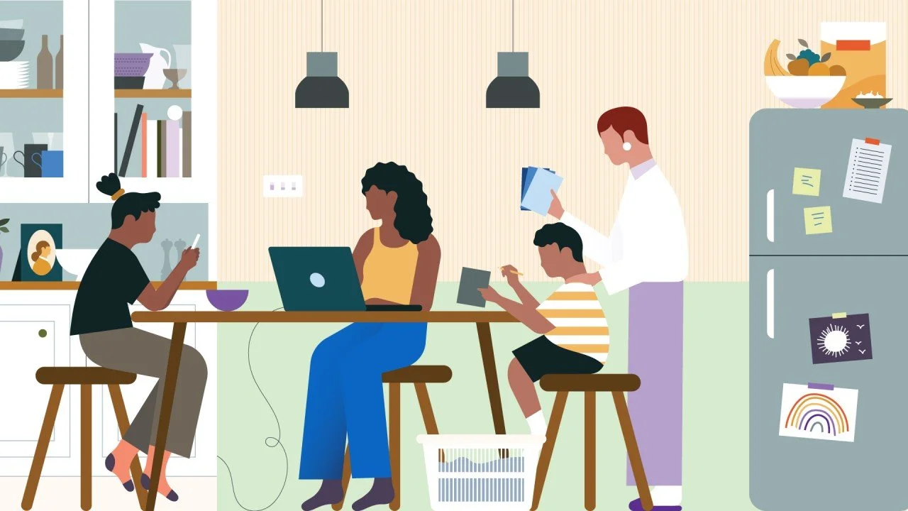
LinkedIn introduced a new, fun style of illustration (by Illustrator Jamie Jones) that showed people having everyday connections and interactions.
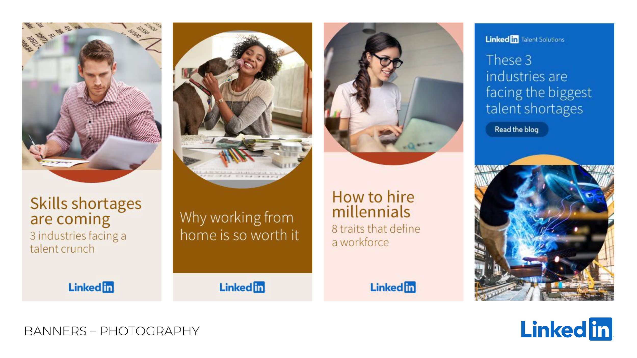
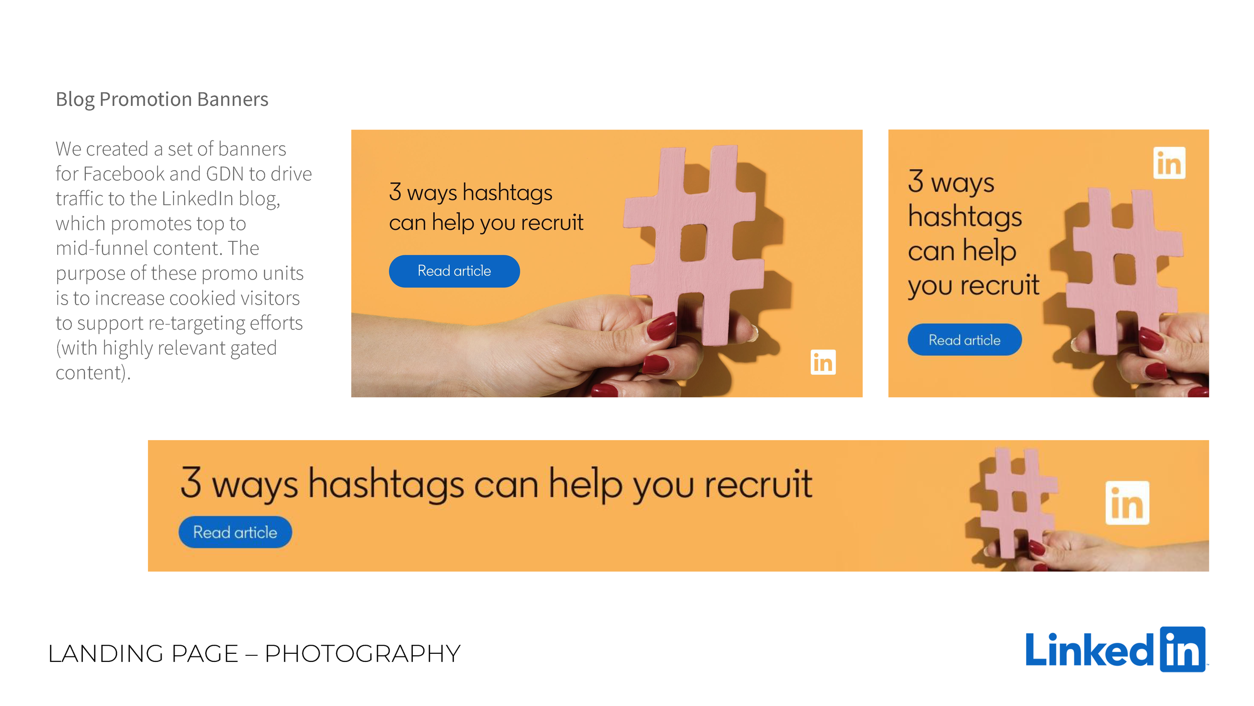
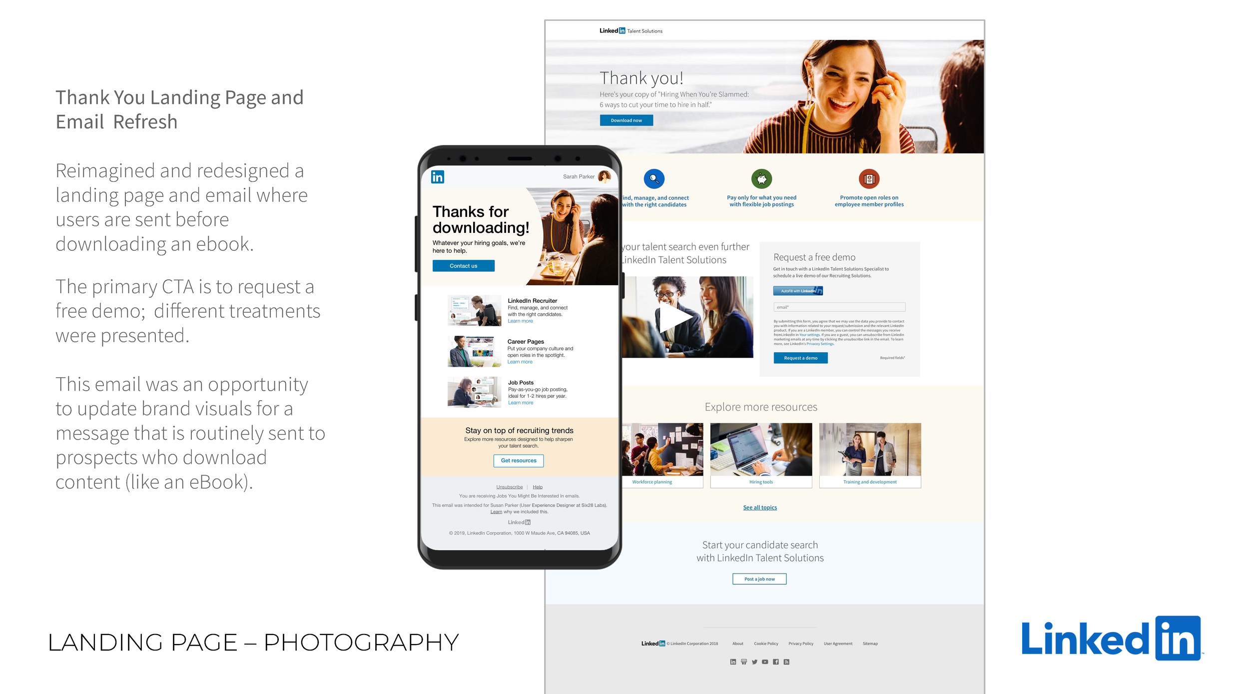
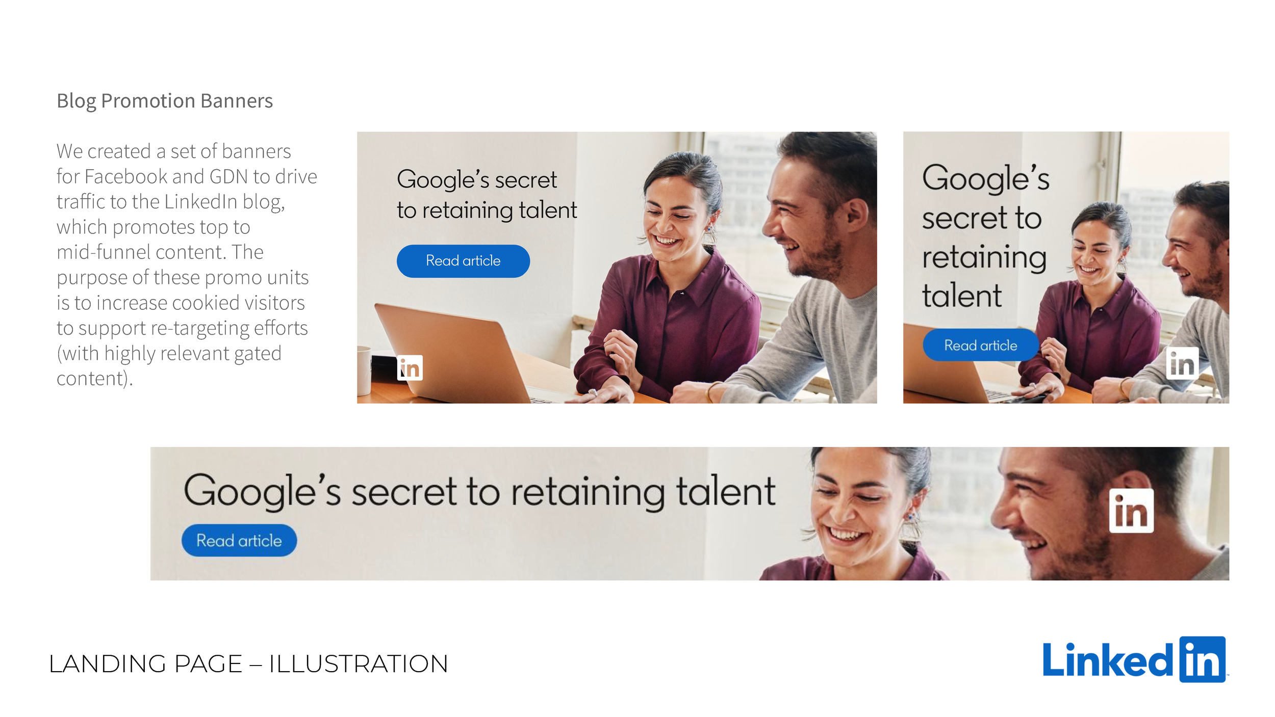
Photography
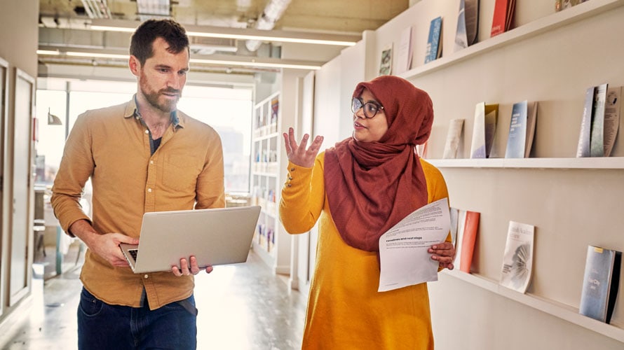
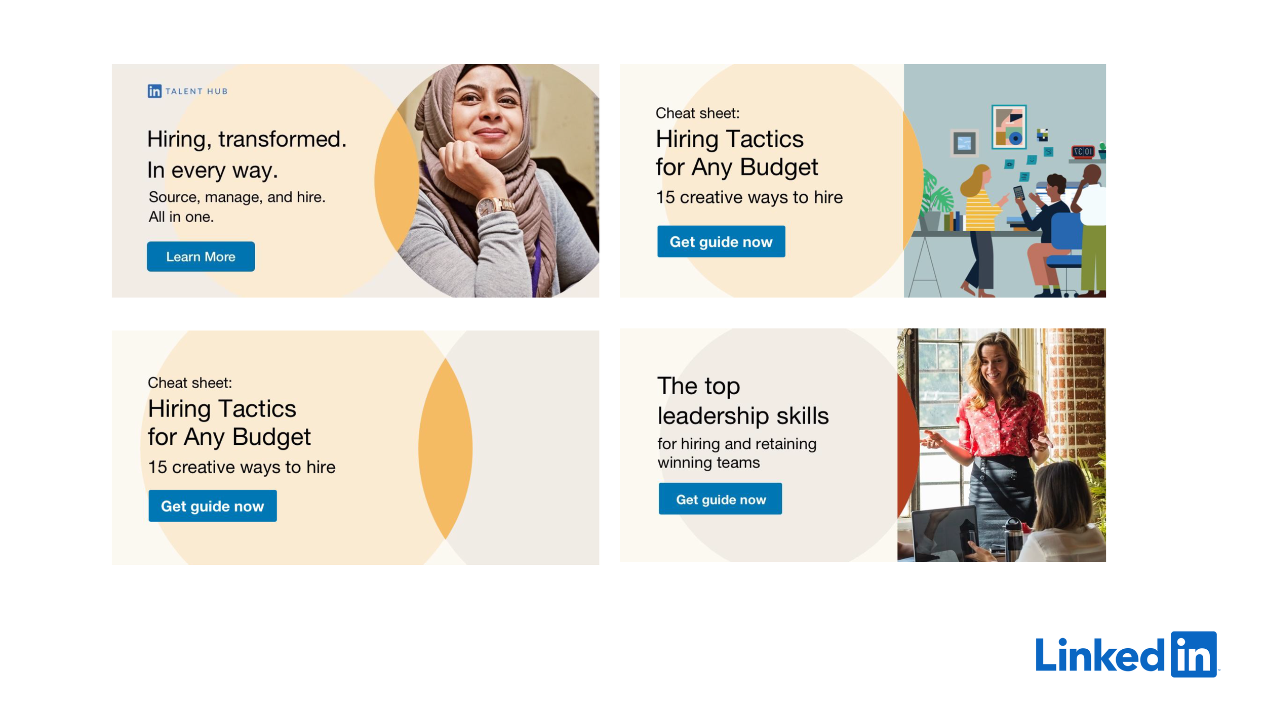
LinkedIn documented real people from all around the world at work to develop a large library of thousands of photos.
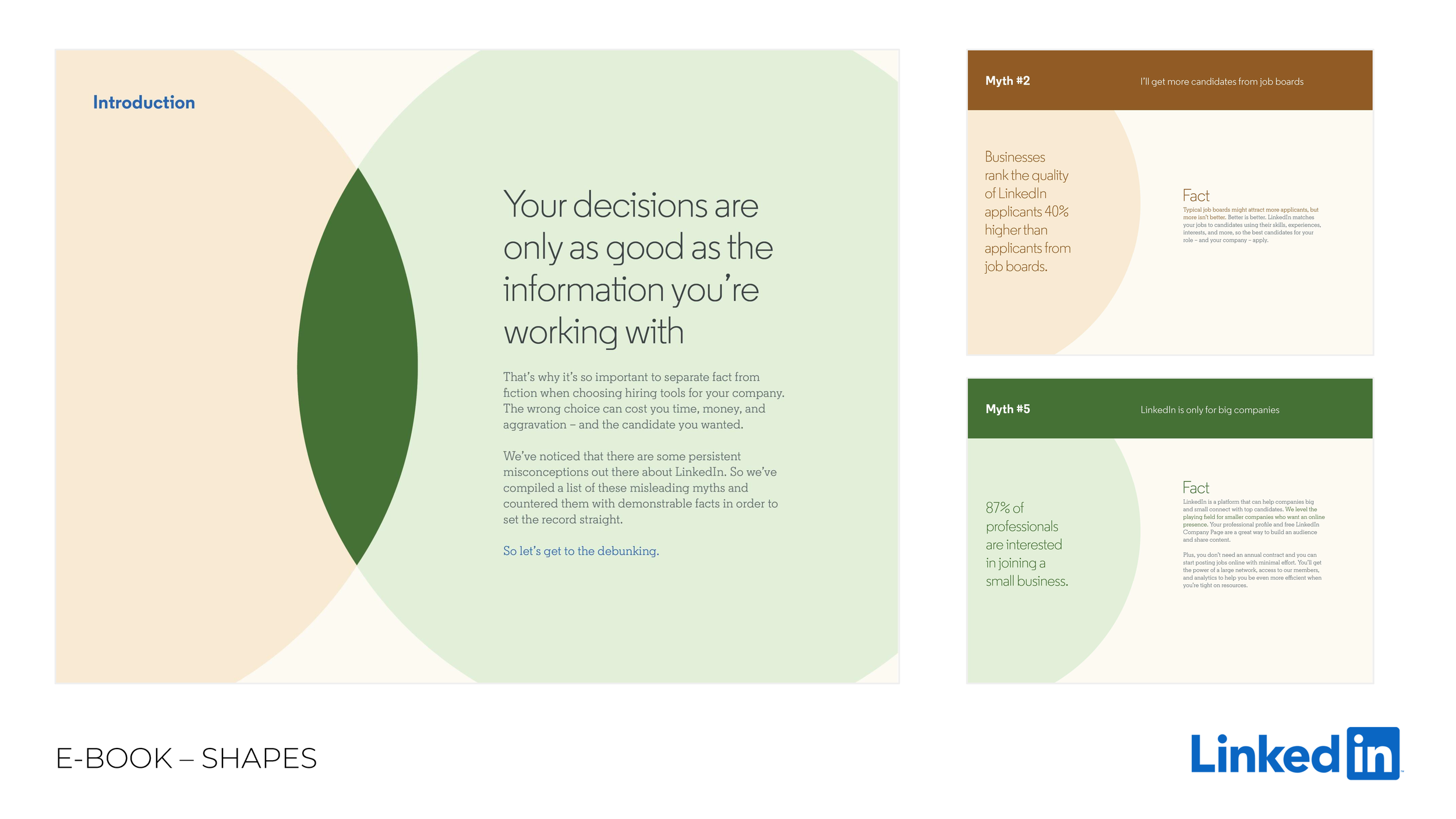
SHAPES
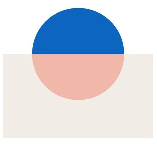
Inspired by the ‘i’ in the LinkedIn logo, a circle and a rectangle are used throughout all materials as design elements.
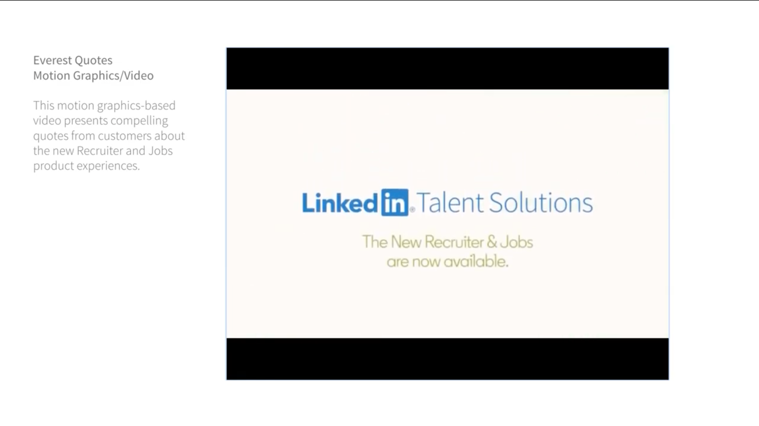
Motion graphics/VIDEO
Following LinkedIn real people approach, video and motion graphic focuses on real people interactions.
Fun fact
Did You Know LinkedIn Changed Its Logo 4 Times? This 2019 refresh aimed to attract new audiences and keep existing users engaged by showing LinkedIn as a supportive community where members help each other achieve success, not just find jobs.
Wow, still here!
Statistically, only the most curious people scroll this far. I like curious people.
Let’s chat about what we can build… together.
CREDITS:
Core Brand Identity: LinkedIn Brand Studio.
Illustration GIFs used in this page: Dani Montesinos